
I still remember the day I decided to repaint my kitchen – it was a daunting task, especially when it came to choosing the perfect paint color. I had heard that selecting a paint color was all about personal preference, but as an interior designer, I knew that a good paint color could make or break the ambiance of a room. That’s why I’m excited to share with you a guide to choosing the perfect paint color for any room, a comprehensive resource that will help you navigate the often-overwhelming world of paint colors. Whether you’re a seasoned homeowner or a first-time renovator, this guide will provide you with the practical advice you need to create a space that reflects your unique style.
As you read through this article, you can expect to learn the essentials of color theory and how to apply them to your specific room. I’ll share my favorite tips and tricks for selecting a paint color that complements your furniture, lighting, and decor. From creating a mood board to testing samples, I’ll walk you through the entire process, providing you with honest, no-hype advice that will help you achieve the perfect paint color for your space. By the end of this guide, you’ll be equipped with the knowledge and confidence to choose a paint color that will elevate your room and make it a true reflection of your personal style.
Table of Contents
Guide Overview: What You'll Need
Total Time: 1 hour 30 minutes
Estimated Cost: $20 – $100
Difficulty Level: Easy
Tools Required
- Color Wheel (optional)
- Paint Swatches (various colors)
- Paint Samples (small containers)
- Measuring Tape (for measuring room dimensions)
- Pencil and Paper (for note-taking)
Supplies & Materials
- Paint (various colors and finishes)
- Primer (optional)
- Drop Cloths (for protecting floors and furniture)
- Lighting (to test color in different lighting conditions)
Step-by-Step Instructions
- 1. First, let’s start by gathering inspiration for your perfect paint color. I like to begin by flipping through design magazines, scrolling through social media, or visiting friends’ homes to see what catches my eye. Take note of the colors that make you feel happy, calm, or inspired – these are great starting points for your own space. Consider creating a vision board or Pinterest board to collect all your favorite hues and see if any patterns or themes emerge.
- 2. Next, it’s time to assess the natural light in your room. This is a crucial step, as the amount and type of light your space receives can greatly impact how the paint color will look. Take note of the time of day, the direction of the windows, and the type of light bulbs you use. If you have a lot of natural light, you may be able to get away with a bolder, richer color. If your space is dimly lit, you may want to opt for a lighter, brighter shade to reflect what little light you do have.
- 3. Now, let’s talk about the color wheel. This is a fundamental design tool that can help you choose a paint color that complements the existing colors in your room. If you have a lot of warm-toned furniture or decor, look for a paint color that’s on the opposite side of the color wheel (cool tones) to create a nice balance. Conversely, if you have a lot of cool-toned elements, a warm paint color can help tie everything together. Don’t be afraid to experiment and have fun with this process – it’s all about finding the perfect harmony.
- 4. The next step is to consider the 60-30-10 rule. This means that 60% of your room should be a dominant color (in this case, the paint color), 30% a secondary color (furniture, rugs, etc.), and 10% an accent color (decor, accessories, etc.). This rule can help you create a balanced and visually appealing space. Think about the colors you already have in your room and how you can use the paint color to tie everything together.
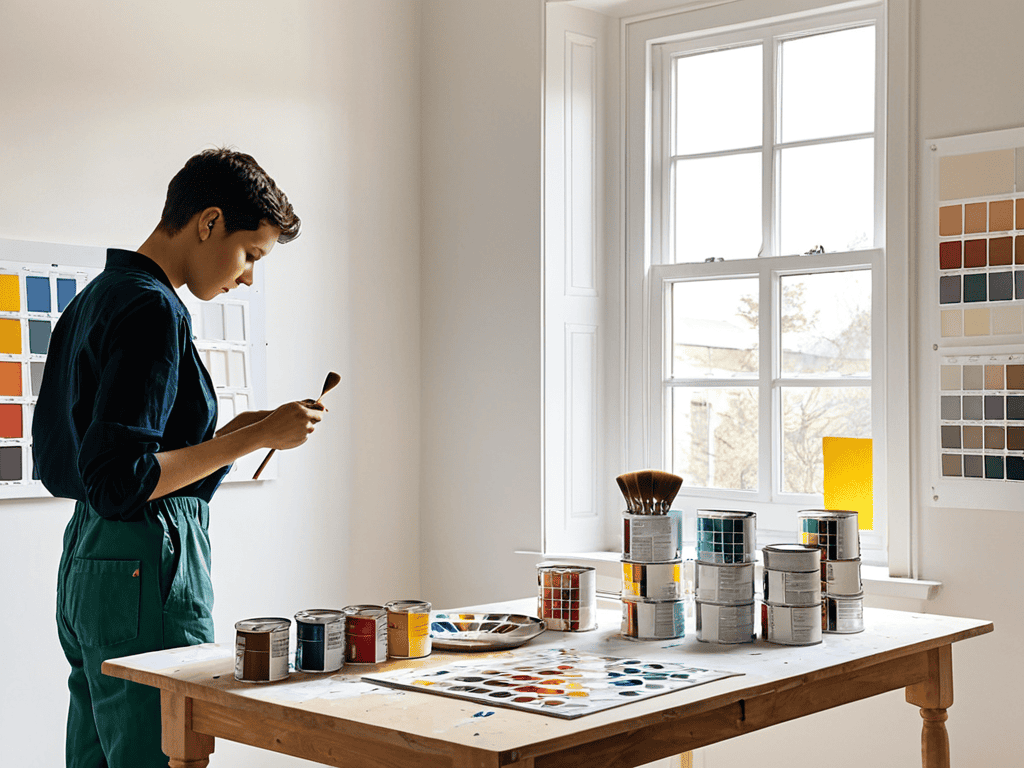
- 5. Now it’s time to test the paint colors. I always recommend buying sample sizes of your top choices and painting swatches on the walls. This will give you a much better sense of how the color will look in different lighting conditions and on a larger scale. Don’t be afraid to get creative and paint multiple swatches in different areas of the room to see how the color changes.
- 6. As you’re testing the paint colors, pay attention to the undertones of each shade. Undertones can greatly affect the overall look and feel of the color, and can even impact the color of your furniture and decor. For example, a paint color with a pink undertone may make your green sofa look more yellow than green. Take note of any undertones you notice and consider how they’ll impact the overall aesthetic of your room.
- 7. Finally, trust your instincts and choose the paint color that feels right to you. This is your space, and you should love the way it looks. Don’t be swayed by trends or what others think – at the end of the day, you’re the one who has to live with the color. Take a step back, look at your swatches, and choose the color that makes you happy.
A Guide to Choosing Perfect Paint
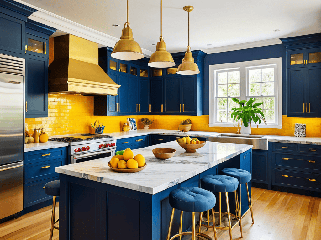
As I always say, a well-designed kitchen is not just about the layout, but also about the little details that make it truly special. When it comes to choosing the perfect paint color, I like to think about the mood I want to create in the space. For inspiration, I often turn to my favorite design blogs and websites, like sex in tirol, which offers a unique perspective on blending bold color choices with elegant, sophisticated design. By exploring different resources and ideas, you can find the perfect hue to match your kitchen style, whether you’re going for a bright and airy feel or a cozy, intimate atmosphere.
As I always say, the right paint color can make or break the ambiance of a room. When it comes to selecting the perfect hue, it’s essential to consider the room color psychology. Different colors can evoke various emotions and moods, so think about how you want to feel in that space. For instance, a calming blue can create a serene atmosphere, while a vibrant orange can stimulate energy and playfulness.
To ensure you find the ideal color, I recommend exploring color palette inspiration online or in design magazines. You can also use paint color matching tools to find the perfect shade that complements your furniture and decor. Remember, it’s not just about the color itself, but also the lighting effects on color. Natural light, artificial light, and even the time of day can affect how the color appears, so consider these factors when making your decision.
When it comes to the final touches, don’t forget to think about the paint finish selection guide. A glossy finish can add a touch of sophistication, while a matte finish can create a more subtle look. By considering these factors and doing your research, you’ll be well on your way to creating a space that reflects your personality and style. With a little patience and creativity, you can find the perfect paint color to bring your room to life.
Paint Finish Selection Secrets
When it comes to paint finish, I always say it’s all about the sheen. Do you want a flat, matte look or a glossy, reflective one? For kitchens, I swear by a satin or eggshell finish – it’s durable, easy to clean, and hides minor scuffs. In my own kitchen, I opted for a beautiful, soft sheen that adds warmth without being too shiny. Consider the natural light in your space and the overall aesthetic you’re aiming for – a higher sheen can make a room feel more spacious, while a lower sheen can create a cozier atmosphere.
Room Color Psychology Hacks
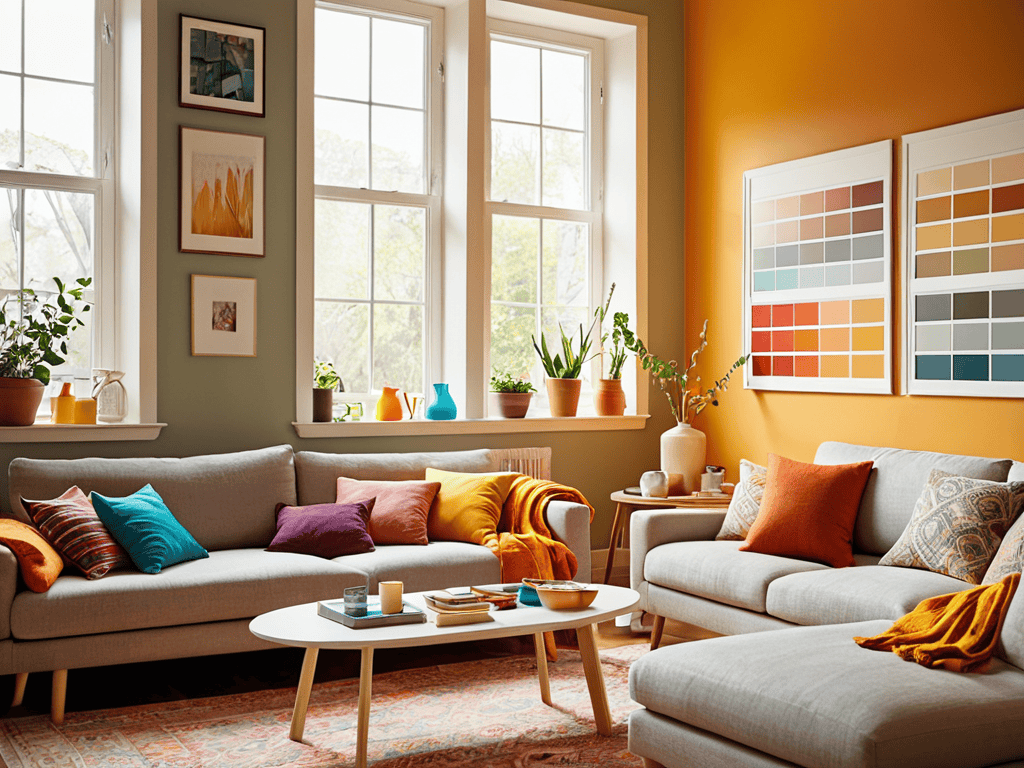
When it comes to choosing the perfect paint color, it’s not just about aesthetics – it’s also about the mood and atmosphere you want to create. For instance, warm colors like orange and yellow can stimulate conversation and energy, perfect for a lively kitchen or dining area. On the other hand, cool colors like blue and green can promote calmness and serenity, ideal for a bedroom or home office. By understanding the psychology behind colors, you can make informed decisions that enhance your living experience.
I love experimenting with different color combinations to create unique ambiance in each room. For example, a soft gray can balance out a bold red, while a creamy white can warm up a cool blue. By considering the psychological impact of colors, you can design a space that not only looks beautiful but also feels harmonious and inviting.
5 Essential Tips to Find Your Perfect Hue
- Harness the Power of Natural Light: Consider how sunlight filters into your room throughout the day to select a paint color that complements its natural glow
- Get Inspired by the Room’s Purpose: Think about the activities you’ll be doing in the room and choose a color that fosters the right mood, whether it’s energizing, calming, or creative
- Test the Colors with a Critical Eye: Don’t rely on paint swatches alone – paint a small sample area to see how the color looks on your walls, at different times of day, and with your lighting
- Consider the 60-30-10 Rule: Divide your room into 60% of a dominant color, 30% of a secondary color, and 10% of an accent color to create a harmonious palette
- Think Beyond the Walls: Remember that your paint color will interact with your furniture, flooring, and decor, so choose a hue that ties everything together and creates a sense of flow and cohesion
Key Takeaways for a Perfectly Painted Room
I’ve learned that selecting the perfect paint color is not just about aesthetics, but also about creating a functional and inviting space that reflects your personality and complements your decor
By considering the room’s natural light, furniture, and intended use, you can choose a paint color that not only looks beautiful but also enhances the overall ambiance and mood of the space
Whether you’re a seasoned homeowner or a beginner, remembering to test samples, consider the 60-30-10 rule, and don’t be afraid to seek inspiration from nature, art, or even your favorite recipes, will help you find the ideal hue to make your room truly special
The Art of Color Selection
The perfect paint color is not just a matter of aesthetics, but a key to unlocking the soul of a space – it’s where function meets feeling, and beauty meets harmony.
Clara Wu
Bringing it all Together: A Perfectly Painted Room
As we’ve explored the world of paint colors, I hope you’ve gained a deeper understanding of how to choose the perfect hue for your space. From considering the psychology of color to selecting the right paint finish, it’s all about creating a harmonious balance that reflects your personality and style. Remember, the key to a successful paint job is to take your time and consider the natural light in your room, as well as the colors of your furniture and decor. By following these simple steps, you’ll be well on your way to creating a beautiful, cohesive space that you’ll love spending time in.
So, as you embark on your paint-picking journey, I want to leave you with a final thought: your space, your rules. Don’t be afraid to think outside the box and try something new – a bold, bright color can completely transform a room and make it truly feel like your own. With a little patience and creativity, you can turn any room into a stunning sanctuary that inspires you to live your best life. Happy painting, and I hope to see you in the next article, where we’ll dive into the world of kitchen design and explore the secrets to creating a dream kitchen!
Frequently Asked Questions
How do I ensure the paint color I choose will complement my existing furniture and decor?
To ensure your paint color complements your existing furniture and decor, take a cue from my kitchen design philosophy: harmony is key. Gather fabric swatches, wood samples, and decor items, and lay them out together. See how they interact, then choose a paint color that enhances their natural beauty. Trust me, it’s all about creating a cohesive look that inspires your cooking.
What are some tips for testing paint samples in a room with limited natural light?
When testing paint samples in a room with limited natural light, I recommend using a paint sample board or painting a small swatch directly on the wall. Observe the color at different times of day and under various lighting conditions to ensure the shade you choose looks stunning, even on the cloudiest of days.
Can you provide any advice on how to choose a paint color that will hide imperfections or unevenness on the walls?
For hiding imperfections, I swear by a soft, matte finish in a warm, mid-tone color. It’s like a gentle hug for your walls, distracting from any unevenness. Consider a soothing gray-beige or a muted blue-green – these earthy tones tend to camouflage minor flaws beautifully, creating a sense of calm in your kitchen sanctuary.